mirror of
https://github.com/formbricks/formbricks.git
synced 2025-12-22 06:00:51 -06:00
Compare commits
13 Commits
feat/custo
...
feat/surve
| Author | SHA1 | Date | |
|---|---|---|---|
|
f712d0722f | ||
|
|
d93773004c | ||
|
|
f789e234f2 | ||
|
|
f7e164c5e9 | ||
|
|
0f30a60447 | ||
|
|
be9be08b5e | ||
|
|
87600ae332 | ||
|
|
dbe061c82c | ||
|
|
e35ccafa23 | ||
|
|
ca0bae423e | ||
|
|
e4d9018f60 | ||
|
|
d530989207 | ||
|
|
a040549b1b |
31
.github/workflows/chromatic.yml
vendored
31
.github/workflows/chromatic.yml
vendored
@@ -13,13 +13,12 @@ jobs:
|
||||
chromatic:
|
||||
name: Run Chromatic
|
||||
runs-on: ubuntu-latest
|
||||
timeout-minutes: 30
|
||||
permissions:
|
||||
packages: write
|
||||
id-token: write
|
||||
actions: read
|
||||
contents: read
|
||||
steps:
|
||||
- name: Harden the runner (Audit all outbound calls)
|
||||
uses: step-security/harden-runner@0634a2670c59f64b4a01f0f96f84700a4088b9f0 # v2.12.0
|
||||
uses: step-security/harden-runner@ec9f2d5744a09debf3a187a3f4f675c53b671911 # v2.13.0
|
||||
with:
|
||||
egress-policy: audit
|
||||
|
||||
@@ -27,16 +26,34 @@ jobs:
|
||||
uses: actions/checkout@11bd71901bbe5b1630ceea73d27597364c9af683 # v4.2.2
|
||||
with:
|
||||
fetch-depth: 0
|
||||
- uses: actions/setup-node@1d0ff469b7ec7b3cb9d8673fde0c81c44821de2a # v4.2.0
|
||||
|
||||
- name: Setup Node.js
|
||||
uses: actions/setup-node@49933ea5288caeca8642d1e84afbd3f7d6820020 # v4.4.0
|
||||
with:
|
||||
node-version: 20
|
||||
|
||||
- name: Install pnpm
|
||||
uses: pnpm/action-setup@a7487c7e89a18df4991f7f222e4898a00d66ddda # v4.1.0
|
||||
|
||||
- name: Get pnpm store directory
|
||||
shell: bash
|
||||
run: |
|
||||
echo "STORE_PATH=$(pnpm store path --silent)" >> $GITHUB_ENV
|
||||
|
||||
- name: Setup pnpm cache
|
||||
uses: actions/cache@5a3ec84eff668545956fd18022155c47e93e2684 # v4.2.3
|
||||
with:
|
||||
path: ${{ env.STORE_PATH }}
|
||||
key: ${{ runner.os }}-pnpm-store-${{ hashFiles('**/pnpm-lock.yaml') }}
|
||||
restore-keys: |
|
||||
${{ runner.os }}-pnpm-store-
|
||||
|
||||
- name: Install dependencies
|
||||
run: pnpm install --config.platform=linux --config.architecture=x64
|
||||
|
||||
- name: Run Chromatic
|
||||
uses: chromaui/action@c93e0bc3a63aa176e14a75b61a31847cbfdd341c # latest
|
||||
uses: chromaui/action@4c20b95e9d3209ecfdf9cd6aace6bbde71ba1694 # v13.3.4
|
||||
with:
|
||||
# ⚠️ Make sure to configure a `CHROMATIC_PROJECT_TOKEN` repository secret
|
||||
projectToken: ${{ secrets.CHROMATIC_PROJECT_TOKEN }}
|
||||
workingDir: apps/storybook
|
||||
zip: true
|
||||
|
||||
@@ -1,101 +1,218 @@
|
||||
# @formbricks/survey-ui
|
||||
|
||||
Reusable UI components package for Formbricks applications.
|
||||
React UI components for building surveys and forms. Includes NPS, rating scales, multi-select, file upload, and more.
|
||||
|
||||
|
||||
|
||||
## Installation
|
||||
|
||||
This package is part of the Formbricks monorepo and is available as a workspace dependency.
|
||||
```bash
|
||||
npm install @formbricks/survey-ui
|
||||
```
|
||||
|
||||
## Usage
|
||||
**Requirements:** React 19 (`react@^19.0.0`)
|
||||
|
||||
## Quick Start
|
||||
|
||||
```tsx
|
||||
import { Button } from "@formbricks/survey-ui";
|
||||
import { OpenText, Rating } from "@formbricks/survey-ui";
|
||||
import "@formbricks/survey-ui/styles";
|
||||
|
||||
function MyComponent() {
|
||||
function Survey() {
|
||||
return (
|
||||
<Button variant="default" size="default">
|
||||
Click me
|
||||
</Button>
|
||||
<div id="fbjs">
|
||||
<OpenText
|
||||
elementId="name"
|
||||
headline="What's your name?"
|
||||
inputId="name-field"
|
||||
placeholder="Enter your name"
|
||||
onChange={(value) => console.log(value)}
|
||||
/>
|
||||
|
||||
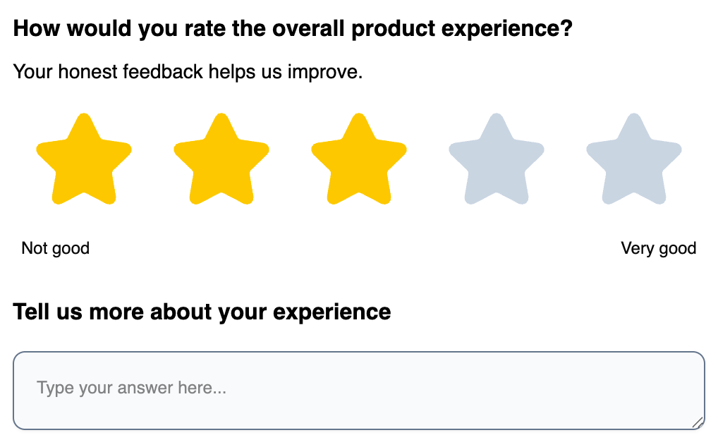
<Rating
|
||||
elementId="rating"
|
||||
headline="Rate your experience"
|
||||
inputId="rating-field"
|
||||
scale="star"
|
||||
range={5}
|
||||
onChange={(value) => console.log(value)}
|
||||
/>
|
||||
</div>
|
||||
);
|
||||
}
|
||||
```
|
||||
|
||||
## Development
|
||||
> **Important:** Components must be wrapped in `<div id="fbjs">` for styles to work.
|
||||
|
||||
```bash
|
||||
# Build the package
|
||||
pnpm build
|
||||
## Components
|
||||
|
||||
# Watch mode for development
|
||||
pnpm dev
|
||||
### Survey Elements
|
||||
|
||||
| Component | Description |
|
||||
|-----------|-------------|
|
||||
| `OpenText` | Text input (single or multi-line) |
|
||||
| `SingleSelect` | Radio button selection |
|
||||
| `MultiSelect` | Checkbox selection |
|
||||
| `Rating` | Star, number, or smiley rating |
|
||||
| `NPS` | Net Promoter Score (0-10) |
|
||||
| `Matrix` | Table/grid selection |
|
||||
| `Ranking` | Drag-and-drop ranking |
|
||||
| `DateElement` | Date picker |
|
||||
| `FileUpload` | File upload with preview |
|
||||
| `PictureSelect` | Image-based selection |
|
||||
| `Consent` | Checkbox with label |
|
||||
| `CTA` | Call-to-action button |
|
||||
| `FormField` | Generic form field wrapper |
|
||||
|
||||
# Lint
|
||||
pnpm lint
|
||||
```
|
||||
### General Components
|
||||
|
||||
## Structure
|
||||
|
||||
```text
|
||||
src/
|
||||
├── components/ # React components
|
||||
├── lib/ # Utility functions
|
||||
└── index.ts # Main entry point
|
||||
```
|
||||
|
||||
## Adding New Components
|
||||
|
||||
### Using shadcn CLI (Recommended)
|
||||
|
||||
This package is configured to work with shadcn/ui CLI. You can add components using:
|
||||
|
||||
```bash
|
||||
cd packages/survey-ui
|
||||
pnpm ui:add <component-name>
|
||||
```
|
||||
|
||||
**Important**: After adding a component, reorganize it into a folder structure:
|
||||
|
||||
For example:
|
||||
```bash
|
||||
pnpm ui:add button
|
||||
pnpm ui:organize button
|
||||
```
|
||||
|
||||
Then export the component from `src/components/index.ts`.
|
||||
|
||||
### Manual Component Creation
|
||||
|
||||
1. Create a new component directory under `src/components/<component-name>/`
|
||||
2. Create `index.tsx` inside that directory
|
||||
3. Export the component from `src/components/index.ts`
|
||||
4. The component will be available from the main package export
|
||||
|
||||
## Component Structure
|
||||
|
||||
Components follow this folder structure:
|
||||
|
||||
```text
|
||||
src/components/
|
||||
├── button.tsx
|
||||
├── button.stories.tsx
|
||||
```
|
||||
| Component | Description |
|
||||
|-----------|-------------|
|
||||
| `Button` | Button with variants: `default`, `outline`, `ghost`, `destructive` |
|
||||
| `Input` | Text input |
|
||||
| `DropdownMenu` | Dropdown menu (Radix UI) |
|
||||
| `ElementHeader` | Question headline + description |
|
||||
| `ElementMedia` | Image/video display |
|
||||
|
||||
## Theming
|
||||
|
||||
This package uses CSS variables for theming. The theme can be customized by modifying `src/styles/globals.css`.
|
||||
Customize the appearance by overriding CSS variables inside `#fbjs`:
|
||||
|
||||
Both light and dark modes are supported out of the box.
|
||||
```css
|
||||
#fbjs {
|
||||
/* Brand color - affects focus rings, selections */
|
||||
--fb-survey-brand-color: #3b82f6;
|
||||
|
||||
## CSS Scoping
|
||||
/* Buttons */
|
||||
--fb-button-bg-color: #3b82f6;
|
||||
--fb-button-text-color: #ffffff;
|
||||
--fb-button-border-radius: 8px;
|
||||
|
||||
By default, this package builds CSS scoped to `#fbjs` for use in the surveys package. This ensures proper specificity and prevents conflicts with preflight CSS.
|
||||
/* Inputs & Options */
|
||||
--fb-input-bg-color: #ffffff;
|
||||
--fb-input-border-radius: 8px;
|
||||
--fb-input-height: 44px;
|
||||
|
||||
To build unscoped CSS (e.g., for standalone usage or Storybook), set the `SURVEY_UI_UNSCOPED` environment variable:
|
||||
|
||||
```bash
|
||||
SURVEY_UI_UNSCOPED=true pnpm build
|
||||
/* Typography */
|
||||
--fb-element-headline-font-size: 18px;
|
||||
--fb-element-headline-font-weight: 600;
|
||||
--fb-element-headline-color: #111827;
|
||||
}
|
||||
```
|
||||
|
||||
**Note:** Storybook imports the source CSS directly and compiles it with its own Tailwind config, so it's not affected by this scoping setting.
|
||||
### All CSS Variables
|
||||
|
||||
<details>
|
||||
<summary>Click to expand full variable reference</summary>
|
||||
|
||||
#### Brand & Accent
|
||||
|
||||
| Variable | Default | Description |
|
||||
|----------|---------|-------------|
|
||||
| `--fb-survey-brand-color` | `#64748b` | Primary accent color |
|
||||
| `--fb-accent-background-color` | `#e2e8f0` | Accent background |
|
||||
| `--fb-accent-background-color-selected` | `#f1f5f9` | Selected accent background |
|
||||
|
||||
#### Buttons
|
||||
|
||||
| Variable | Default | Description |
|
||||
|----------|---------|-------------|
|
||||
| `--fb-button-bg-color` | `#1e293b` | Button background |
|
||||
| `--fb-button-text-color` | `#f8fafc` | Button text |
|
||||
| `--fb-button-border-radius` | `10px` | Button corners |
|
||||
| `--fb-button-height` | `36px` | Button height |
|
||||
| `--fb-button-font-size` | `14px` | Button text size |
|
||||
| `--fb-button-font-weight` | `500` | Button text weight |
|
||||
| `--fb-button-padding-x` | `16px` | Horizontal padding |
|
||||
| `--fb-button-padding-y` | `8px` | Vertical padding |
|
||||
|
||||
#### Inputs
|
||||
|
||||
| Variable | Default | Description |
|
||||
|----------|---------|-------------|
|
||||
| `--fb-input-bg-color` | `#f8fafc` | Input background |
|
||||
| `--fb-input-border-color` | `#64748b` | Input border (uses brand color) |
|
||||
| `--fb-input-border-radius` | `10px` | Input corners |
|
||||
| `--fb-input-height` | `40px` | Input height |
|
||||
| `--fb-input-color` | `#0a0a0a` | Input text color |
|
||||
| `--fb-input-font-size` | `14px` | Input text size |
|
||||
| `--fb-input-placeholder-opacity` | `0.5` | Placeholder opacity |
|
||||
| `--fb-input-padding-x` | `16px` | Horizontal padding |
|
||||
| `--fb-input-padding-y` | `16px` | Vertical padding |
|
||||
| `--fb-input-shadow` | `0 1px 2px rgba(0,0,0,0.05)` | Input shadow |
|
||||
|
||||
#### Options (Radio/Checkbox)
|
||||
|
||||
| Variable | Default | Description |
|
||||
|----------|---------|-------------|
|
||||
| `--fb-option-bg-color` | `#f8fafc` | Option background |
|
||||
| `--fb-option-label-color` | `#0a0a0a` | Option text color |
|
||||
| `--fb-option-border-radius` | `10px` | Option corners |
|
||||
| `--fb-option-padding-x` | `16px` | Horizontal padding |
|
||||
| `--fb-option-padding-y` | `16px` | Vertical padding |
|
||||
| `--fb-option-font-size` | `14px` | Option text size |
|
||||
|
||||
#### Headlines & Descriptions
|
||||
|
||||
| Variable | Default | Description |
|
||||
|----------|---------|-------------|
|
||||
| `--fb-element-headline-font-size` | `16px` | Headline size |
|
||||
| `--fb-element-headline-font-weight` | `400` | Headline weight |
|
||||
| `--fb-element-headline-color` | `#000000` | Headline color |
|
||||
| `--fb-element-description-font-size` | `14px` | Description size |
|
||||
| `--fb-element-description-color` | `#000000` | Description color |
|
||||
|
||||
#### Progress Bar
|
||||
|
||||
| Variable | Default | Description |
|
||||
|----------|---------|-------------|
|
||||
| `--fb-progress-track-height` | `8px` | Track height |
|
||||
| `--fb-progress-track-bg-color` | `rgba(30,41,59,0.2)` | Track background |
|
||||
| `--fb-progress-indicator-bg-color` | `#1e293b` | Indicator background |
|
||||
|
||||
</details>
|
||||
|
||||
### Theme Examples
|
||||
|
||||
**Blue Theme:**
|
||||
```css
|
||||
#fbjs {
|
||||
--fb-survey-brand-color: #2563eb;
|
||||
--fb-button-bg-color: #2563eb;
|
||||
--fb-button-text-color: #ffffff;
|
||||
}
|
||||
```
|
||||
|
||||
**Green Theme:**
|
||||
```css
|
||||
#fbjs {
|
||||
--fb-survey-brand-color: #16a34a;
|
||||
--fb-button-bg-color: #16a34a;
|
||||
--fb-button-text-color: #ffffff;
|
||||
}
|
||||
```
|
||||
|
||||
**Rounded Theme:**
|
||||
```css
|
||||
#fbjs {
|
||||
--fb-input-border-radius: 9999px;
|
||||
--fb-button-border-radius: 9999px;
|
||||
--fb-option-border-radius: 16px;
|
||||
}
|
||||
```
|
||||
|
||||
## TypeScript
|
||||
|
||||
All components export their prop types:
|
||||
|
||||
```tsx
|
||||
import {
|
||||
OpenText, type OpenTextProps,
|
||||
Rating, type RatingProps,
|
||||
SingleSelect, type SingleSelectProps, type SingleSelectOption
|
||||
} from "@formbricks/survey-ui";
|
||||
```
|
||||
|
||||
## License
|
||||
|
||||
MIT — [Formbricks](https://formbricks.com)
|
||||
|
||||
BIN
packages/survey-ui/images/survey-preview.png
Normal file
BIN
packages/survey-ui/images/survey-preview.png
Normal file
Binary file not shown.
|
After Width: | Height: | Size: 21 KiB |
@@ -1,22 +1,47 @@
|
||||
{
|
||||
"name": "@formbricks/survey-ui",
|
||||
"license": "MIT",
|
||||
"version": "1.0.0",
|
||||
"private": true,
|
||||
"description": "Reusable UI components for Formbricks applications",
|
||||
"version": "1.0.4",
|
||||
"description": "React UI components for building surveys and forms - includes NPS, rating scales, multi-select, file upload, and more. Built with Radix UI and Tailwind CSS.",
|
||||
"homepage": "https://formbricks.com",
|
||||
"type": "module",
|
||||
"keywords": [
|
||||
"react",
|
||||
"survey",
|
||||
"form",
|
||||
"ui",
|
||||
"components",
|
||||
"nps",
|
||||
"rating",
|
||||
"questionnaire",
|
||||
"feedback",
|
||||
"formbricks",
|
||||
"tailwindcss",
|
||||
"typescript",
|
||||
"accessible"
|
||||
],
|
||||
"author": {
|
||||
"name": "Formbricks",
|
||||
"url": "https://formbricks.com"
|
||||
},
|
||||
"repository": {
|
||||
"type": "git",
|
||||
"url": "https://github.com/formbricks/formbricks"
|
||||
"url": "https://github.com/formbricks/formbricks",
|
||||
"directory": "packages/survey-ui"
|
||||
},
|
||||
"sideEffects": false,
|
||||
"bugs": {
|
||||
"url": "https://github.com/formbricks/formbricks/issues"
|
||||
},
|
||||
"sideEffects": [
|
||||
"**/*.css"
|
||||
],
|
||||
"source": "src/index.ts",
|
||||
"main": "dist/index.js",
|
||||
"module": "dist/index.js",
|
||||
"types": "dist/index.d.ts",
|
||||
"files": [
|
||||
"dist"
|
||||
"dist",
|
||||
"README.md"
|
||||
],
|
||||
"exports": {
|
||||
".": {
|
||||
|
||||
@@ -47,7 +47,10 @@ export default defineConfig({
|
||||
},
|
||||
plugins: [
|
||||
tsconfigPaths(),
|
||||
dts({ include: ["src"] }),
|
||||
dts({
|
||||
include: ["src"],
|
||||
exclude: ["**/*.stories.tsx", "**/*.test.ts", "**/story-helpers.ts"],
|
||||
}),
|
||||
tailwindcss(),
|
||||
],
|
||||
test: {
|
||||
|
||||
Reference in New Issue
Block a user